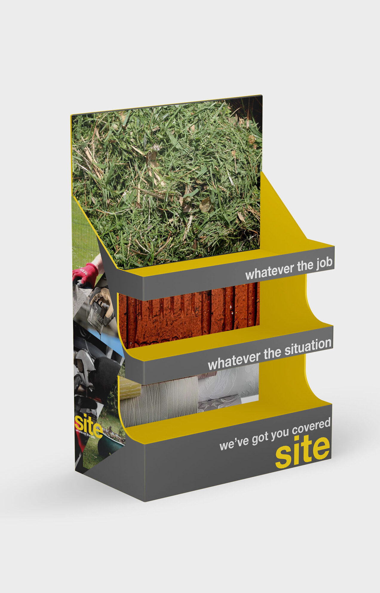
Packaging Redesign.
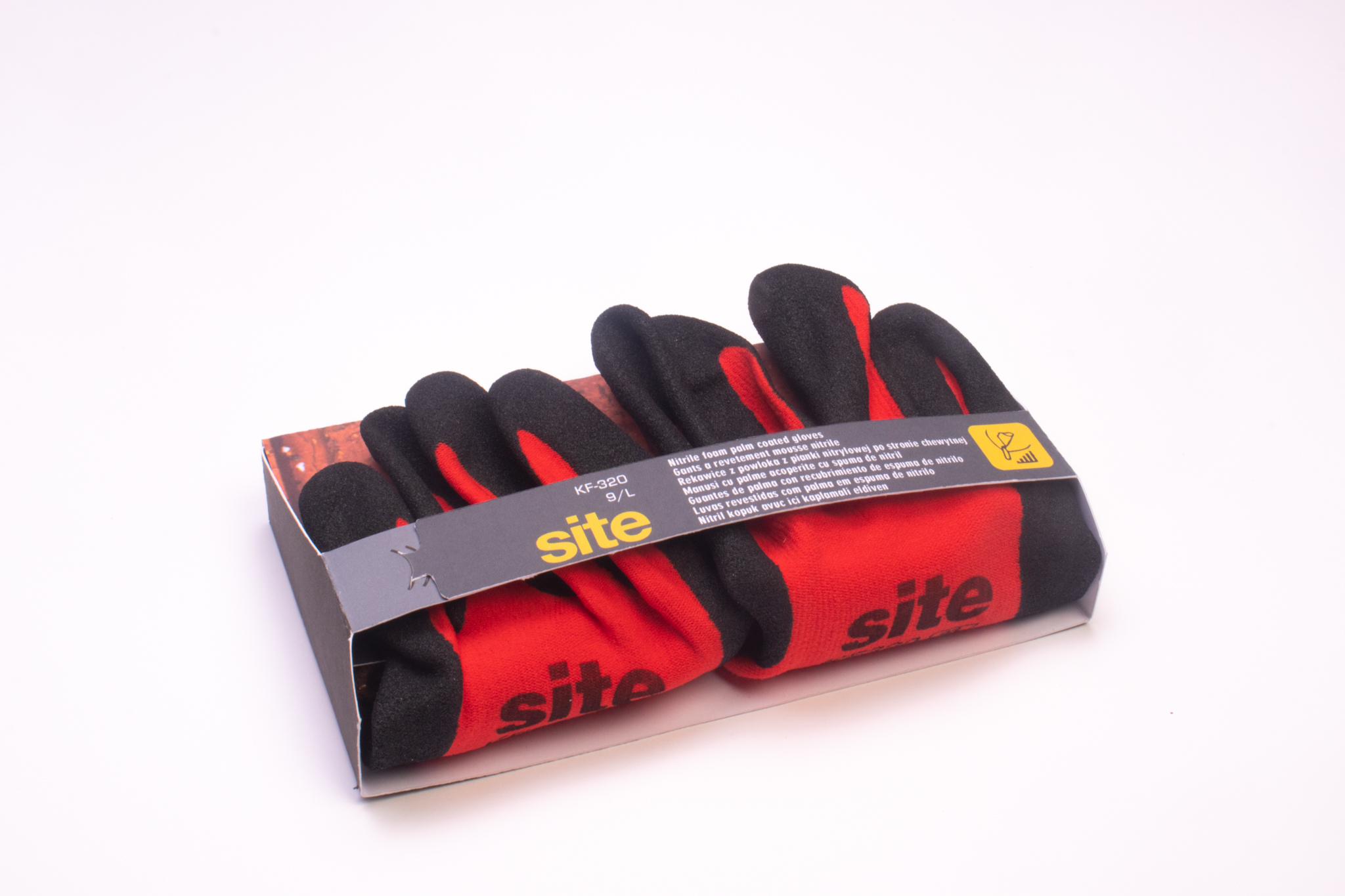
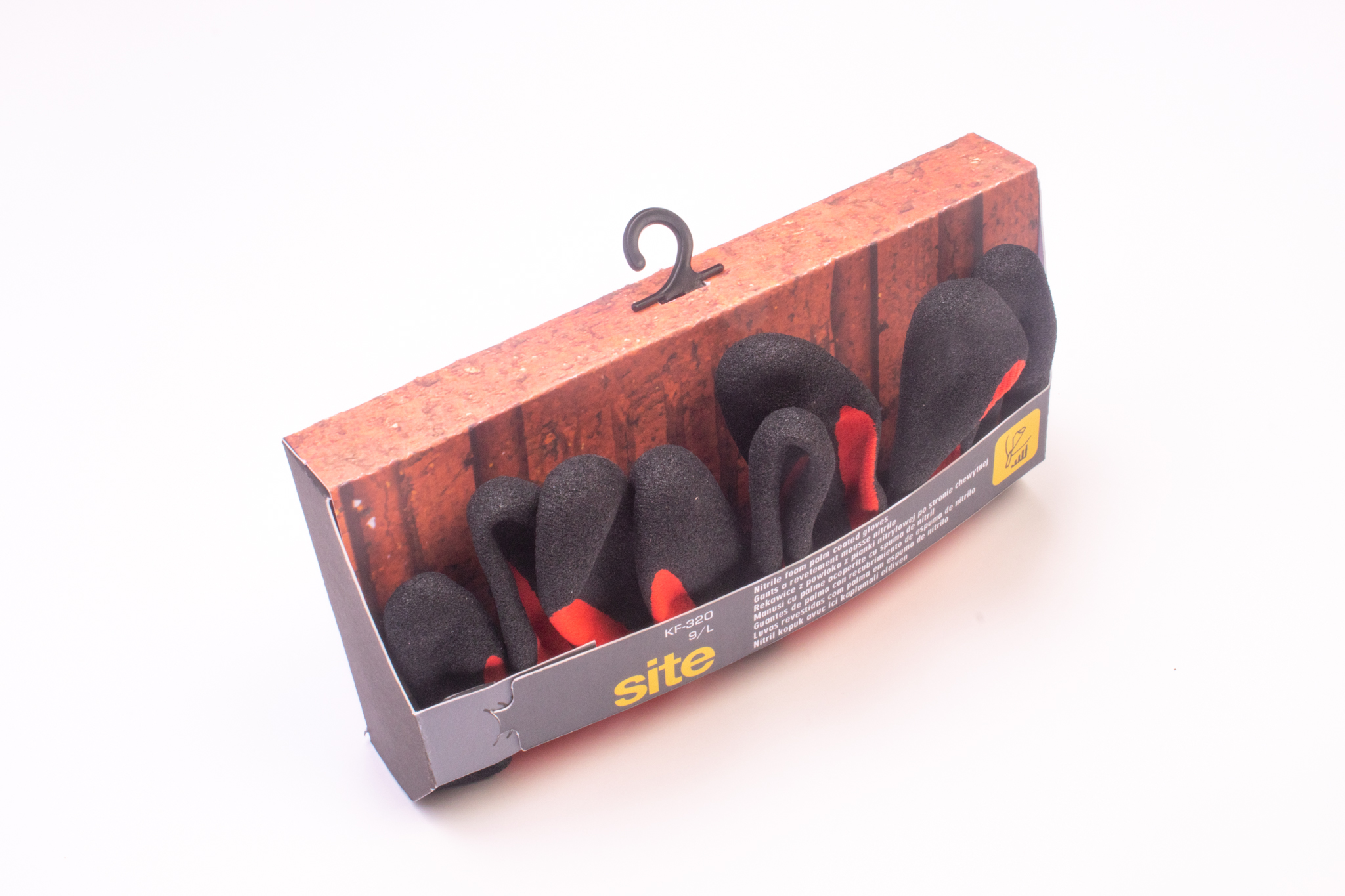
This was a brief which was open to interpretation, I was given the word “gloves” and told to design a packaging solution for them, following my research I came up with the packaging below, with the concept of placing high resolution images onto the packaging to clearly indicate to novice DIYers what the gloves are suitable for, while providing the necessary information for regulatory bodies.
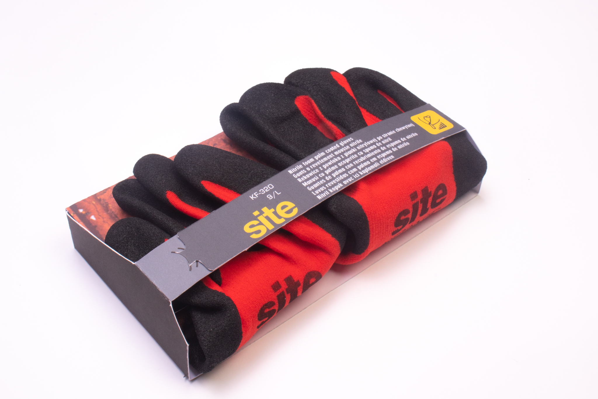
Development started with a simple concept, What makes a premium product, how to change from the cheaper fold over tagged style to a more user experienced focus of packaging and increase its value to the end consumer.
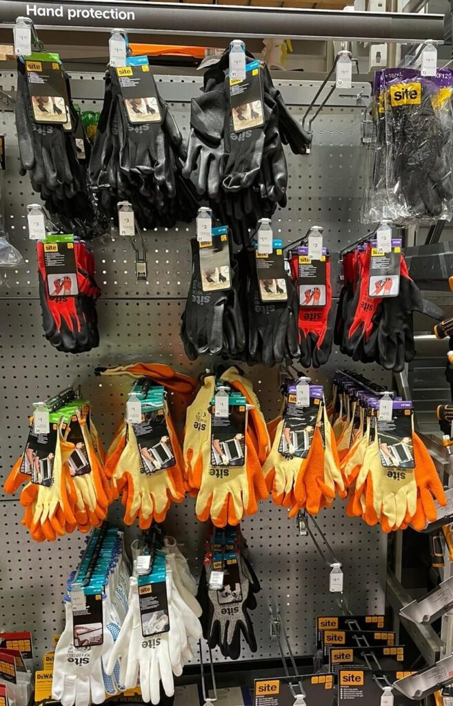
Currently the Site packaging is very utilitarian and while they do contain images for their job purposes, I felt that they could be made to be obvious to average joe public regarding their useage without having to stand infront of a bay to identify the ones suitable for the job.
This was with the aim of a wrap around design to show the glove “holding” the intended usage item, I originally identified several tasks, Mechanics (oil / tools), Landscaping (Grass cuttings or bushes), Decorating (Cans of paint or rolls of wallpaper) General purpose (solvents / acids, Petrol) Warm winter gloves general purpose (thicker lining so with a frost glaze or ice)
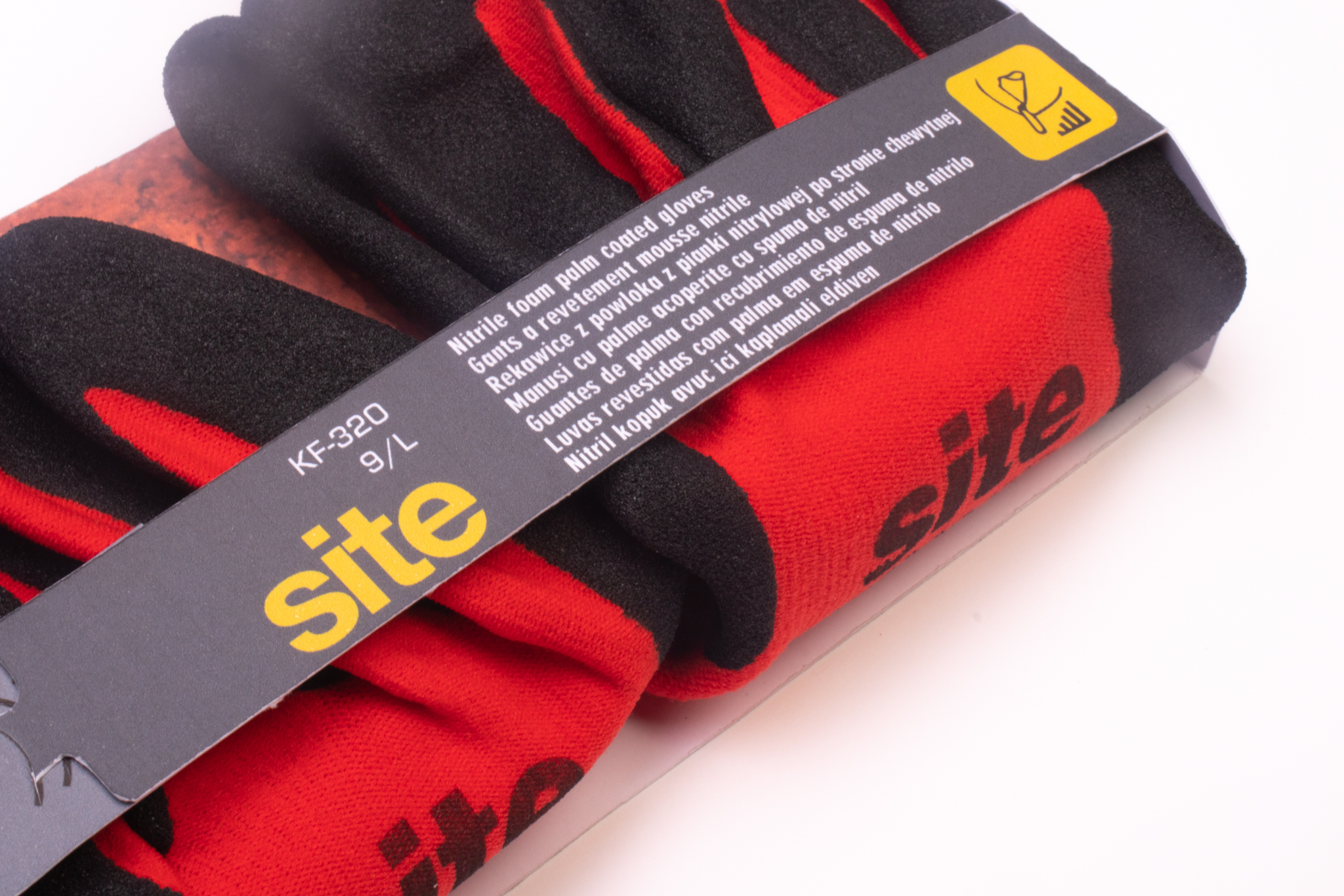
For the mockups I employed the general use nitrile information and sub mark which is an industry standardised marking and featured on several gloves during my research. in this larger format consumers can visualise the task at hand and immediately reach for the correct glove for the job.
Completed: January, 2022
